Mendix reference, reference set, boolean, and enumeration selector with a search bar and a clear button.
If you are using Mendix 8.17 - 9.12, please use the following widget or check the older versions in the marketplace. (The older version does not support reference sets or enumerations)
https://github.com/bsgriggs/mendix8-searchable-reference-selector
https://marketplace.mendix.com/link/component/116917
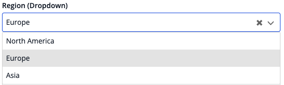
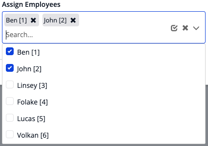
| Dropdown Reference or Enum | Dropdown Reference Set |
|---|---|
 |
 |
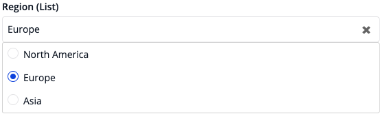
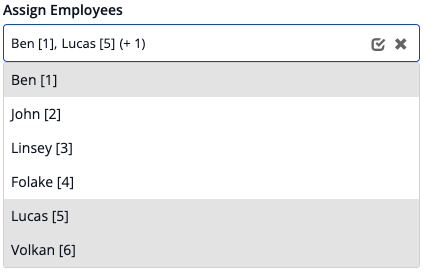
| List On Page Reference or Enum | List On Page Reference Set |
|---|---|
 |
 |
Note: checkboxes, radio buttons, or background color settings are independent. All can be used at any time
- Dropdown or list selection for enumerations, booleans, references, or reference sets
- Can use "Max Items" setting to limit objects retrieved at once use if you encounter longer load times
- Filtering is done by the Mendix runtime or the browser
- Option to search against multiple attributes at the same time with Option content types 'Expression' and 'Custom'
- Button to clear the selection / all selections - can be disabled
- Button to select all the options in a reference set - can be disabled
- Option to make the content un-searchable - allows you to show a dynamic list of checkboxes / radio buttons
- Option to use either Contains or StartsWith functions
- Option to render options as checkboxes, radio buttons, or cells
- Option to render attribute text, HTML content, a string expression, or custom content from Mendix
- Option to render a reference set's values with either badges or as a comma-separated list
- Option to make badges color any of the 7 brand styles (default, info, primary, inverse, success, warning, danger)
- Option to define your own filtering logic with a Microflow and a helper object
- Ability to mark specific options as un-selectable
- Ability to customize the icons and their tooltips
- Support for arrow keys and enter key press
- Searching auto-highlights the first record for easier selection with the enter key
- Option to wait to run the data source until the dropdown is opened
- Ability to show only a sub-set of Enum values
- Ability to auto-focus either the selected option or specific options
Please see the following documentation based on the Selection Type you wish to use.
Check here for more information on using manual filtering. Many of the options are removed with the expectation you will be adding the features manually in your microflow data source.
You likely have too many options trying to render at once. Here are some things to help address the problem:
- Try using the "Max Items" setting. This will limit the amount of options available on the first render and display the "More Results Text" at the end of the list. When a user searches for something, it will still consider the options that are not rendered
- Try limiting the data source based on what you already know. For example, if your form is for selecting McDonald's locations. Make the user select a state or country first then use that information to limit the data source.
- Too many badges displaying when you have a reference set? Use the "Max Reference Display" setting. This will only render the first x amount of badges then include (+x) for the number of remaining selected.
- Only use the "Selectable Attribute" if you absolutely need it. Sometimes it is better to not display a record at all (e.g. adding xpath to the data source) instead of displaying it as un-selectable.
https://widgettesting105-sandbox.mxapps.io/p/searchable-reference-selector
https://github.com/bsgriggs/mendix9-searchable-reference-selector/issues
This widget is open source. Feel free to clone the GitHub repository, make whatever changes you need, and submit a pull request! **Requires Node v14 and NPM v6 - if you already have a different version of Node / NPM, then download NVM to switch between versions **
Benjamin Griggs