Searchable Selector

Content Type: Widget
Categories: User Interface,Data

Overview

Mendix reference, reference set, boolean, and enumeration selector with a search bar and a clear button.


**If you are using Mendix 8.17 - 9.12**, use the following widget or check older version in the marketplace:  


https://github.com/bsgriggs/mendix8-searchable-reference-selector  

Documentation

Demo urlhttps://widgettesting105-sandbox.mxapps.io/p/searchable-reference-selector

Searchable Selector

Mendix reference, reference set, boolean, and enumeration selector with a search bar and a clear button.

If you are using Mendix 8.17 - 9.12, please use the following widget or check the older versions in the marketplace. (The older version does not support reference sets or enumerations)
https://github.com/bsgriggs/mendix8-searchable-reference-selector
https://marketplace.mendix.com/link/component/116917

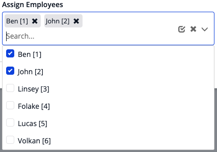
Dropdown Reference or Enum Dropdown Reference Set
DropdownRef DropdownRefSet
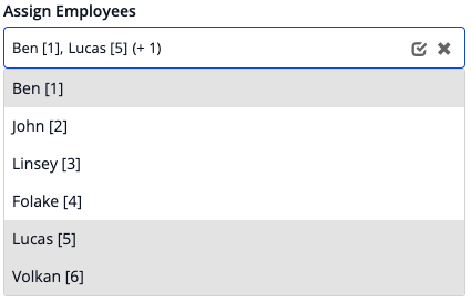
List On Page Reference or Enum List On Page Reference Set
ListRef ListRefSet

Note: checkboxes, radio buttons, or background color settings are independent. All can be used at any time

Features

  • Dropdown or list selection for enumerations, booleans, references, or reference sets
  • Can use "Max Items" setting to limit objects retrieved at once use if you encounter longer load times
  • Filtering is done by the Mendix runtime or the browser
  • Option to search against multiple attributes at the same time with Option content types 'Expression' and 'Custom'
  • Button to clear the selection / all selections - can be disabled
  • Button to select all the options in a reference set - can be disabled
  • Option to make the content un-searchable - allows you to show a dynamic list of checkboxes / radio buttons
  • Option to use either Contains or StartsWith functions
  • Option to render options as checkboxes, radio buttons, or cells
  • Option to render attribute text, HTML content, a string expression, or custom content from Mendix
  • Option to render a reference set's values with either badges or as a comma-separated list
  • Option to make badges color any of the 7 brand styles (default, info, primary, inverse, success, warning, danger)
  • Option to define your own filtering logic with a Microflow and a helper object
  • Ability to mark specific options as un-selectable
  • Ability to customize the icons and their tooltips
  • Support for arrow keys and enter key press
  • Searching auto-highlights the first record for easier selection with the enter key
  • Option to wait to run the data source until the dropdown is opened
  • Ability to show only a sub-set of Enum values
  • Ability to auto-focus either the selected option or specific options

Configuration

Please see the following documentation based on the Selection Type you wish to use.

Check here for more information on using manual filtering. Many of the options are removed with the expectation you will be adding the features manually in your microflow data source.

Performance Issues?

You likely have too many options trying to render at once. Here are some things to help address the problem:

  • Try using the "Max Items" setting. This will limit the amount of options available on the first render and display the "More Results Text" at the end of the list. When a user searches for something, it will still consider the options that are not rendered
  • Try limiting the data source based on what you already know. For example, if your form is for selecting McDonald's locations. Make the user select a state or country first then use that information to limit the data source.
  • Too many badges displaying when you have a reference set? Use the "Max Reference Display" setting. This will only render the first x amount of badges then include (+x) for the number of remaining selected.
  • Only use the "Selectable Attribute" if you absolutely need it. Sometimes it is better to not display a record at all (e.g. adding xpath to the data source) instead of displaying it as un-selectable.

Demo project

https://widgettesting105-sandbox.mxapps.io/p/searchable-reference-selector

Issues, suggestions and feature requests

https://github.com/bsgriggs/mendix9-searchable-reference-selector/issues

This widget is open source. Feel free to clone the GitHub repository, make whatever changes you need, and submit a pull request! **Requires Node v14 and NPM v6 - if you already have a different version of Node / NPM, then download NVM to switch between versions **

Development and contribution

Benjamin Griggs

Releases

Version: 6.0.0
Framework Version: 9.24.0
Release Notes: - added the ability to add a footer to the option menu - enabled the search text attribute for all types -> allows you to use what the user typed in Studio Pro to make new objects Bug fixes: - fixed an issue causing keyboard navigation to scroll to the previous option instead of the current - fixed an issue causing the clean icon & text settings to be hidden
Version: 5.4.1
Framework Version: 9.18.5
Release Notes: - removed console.log - fixed auto-focus for clicking on the dropdown
Version: 5.4.0
Framework Version: 9.18.5
Release Notes: - added the ability to dynamically choose the auto-focused option - added clear all icon and clear all icon text to specify these differently than the badge clear buttons for reference sets (needed for accessibility)
Version: 5.3.1
Framework Version: 9.18.5
Release Notes: - bug fix: page sizes > 20 were ignored with Filter Type 'By Data Source Microflow'
Version: 5.2.0
Framework Version: 9.18.5
Release Notes: New Features: - Added an option to 'Auto focus selected'. Forces the widget to focus on the selected value when the dropdown opens. (Only if the selected value is on the current page) - Expression to mark Aria Required - Added many text templates for accessibility controls Bug Fixes: - fixed the input styling for empty reference sets
Version: 5.1.0
Framework Version: 9.18.0
Release Notes: - added the ability to show a sub-set of enumeration values
Version: 5.0.0
Framework Version: 9.18.0
Release Notes: New Features: - Added support for filtering on AutoNumbers (requires Mendix 9.18.5(LTS)+ or 9.23.0+) - Added option to use client-side filtering - Added OnEnter action - Ability to wait for loading the data until the user has clicked on the dropdown for the first time (Useful if the widget is inside a list view/ gallery) - Added aria-label for the entire dropdown for cases where you are not using the system label - Added boolean selection - List of page setting now works with Max Menu height to show a scroll bar (defaults to show all without a scroll bar) Bug fixes: - Badge label was tabbable even if there was no OnBadgeClick action - Max Items was not being watched for changes Breaking changes: - If you were Option Content Type "Text" with an enumeration attribute, you will receive an error ~ "only AutoNumbers, String, Integers, Longs, and Decimals are selectable". Open the widget settings, switch Option Content Type to "Expression", and set Filter Location to "Client Side" - If you were using Option Content Type "Expression", you will have to re-select the Option Content Type
Version: 4.2.0
Framework Version: 9.18.0
Release Notes: bug fix: filter for enumerations was against the key value instead of the caption
Version: 4.1.1
Framework Version: 9.18.0
Release Notes: - fixed the links to other docs in the ReadMe
Version: 4.1.0
Framework Version: 9.18.0
Release Notes: - added event On Extra Click that runs when the user clicks on the (+n) text for reference sets - renamed On Badge Click to On Value Click and made it available for comma separated - made badges and commas with an On Value Click selectable via keyboard navigation - bug fix: clicking on the dropdown icon itself would not open the dropdown