Antd Button
Overview
This widget provide a Ant Design Button in Mendix. Clicking a Button will trigger some actions/logics in Mendix.
View features of this project on online demo.
Features
-
5 type of button provided:
- Primary button: indicate the main action, one primary button at most in one section.
- Default button: indicate a series of actions without priority.
- Dashed button: used for adding action commonly.
- Text button: used for the most secondary action.
- Link button: used for external links.
-
And 3 other properties additionally.
- danger: used for actions of risk, like deletion or authorization.
- ghost: used in situations with complex background, home pages usually.
- disabled: when actions are not available.
-
If a large or small button is desired, set the size property to either large or small respectively. Omit the size property for a button with the default size.
-
3 shapes options: Default, Circle, Round.
-
block property will make the button fit to its parent width.
Documentation
Introduction
This widget provide a Ant Design Button in Mendix. Clicking a Button will trigger some actions/logics in Mendix.
Features
-
5 type of button provided:
- Primary button: indicate the main action, one primary button at most in one section.
- Default button: indicate a series of actions without priority.
- Dashed button: used for adding action commonly.
- Text button: used for the most secondary action.
- Link button: used for external links.
-
And 3 other properties additionally.
- danger: used for actions of risk, like deletion or authorization.
- ghost: used in situations with complex background, home pages usually.
- disabled: when actions are not available.
-
If a large or small button is desired, set the size property to either large or small respectively. Omit the size property for a button with the default size.
-
3 shapes options: Default, Circle, Round.
-
block property will make the button fit to its parent width.
Installation and Usage
Add this widget to the Mendix Project
- Download the mpk file from here.
- Copy the mpk file to your Mendix Project directory {YourMendixProjectFolder}/widgets/.
- Open your Mendix Project with Mendix Studio Pro and click on the menu Menu > App > Synchronize App Directory.
Configuration
-
Add widget Antd Button to a Page.
-
Config the parameters, including: Caption, Type, Shape, Size, Block , OnClick Event and etc.

-
Run the project locally and check.
Demo Project
- You can access the online demo from here to show the features of this widget.
- You can also download the demo project to run it on your own PC.
Datail of properties
Main Section
- Caption:button text.
- Button Type:button type.
- Button Shape:button shape.
- Button Size:button size.
- Button Block:full width as parent or not.
Status Section
- Disabled:status default as No.
- Danger:status default as No.
- Ghost:status default as No.
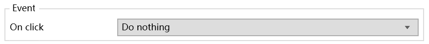
Event Section
- OnClick Event:button event.