Toggle With Label
Content Type: Widget
Categories: User Interface
Overview
The Toggle with label is a widget used to select between two options, either ON or OFF. It does not maintain the state itself.
Documentation
Toggle
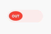
The Toggle button have an editable Label.
Description
The Toggle with label is a widget used to select between two options, either ON or OFF. It does not maintain the state itself.
Introduction
The Toggle widget enables toggling a Boolean attribute.
Usage
To use this widget, place it in a data container that has a Boolean attribute. The widget offers the following for configuration: • The Toggle button have a editable Label with default colors • A Boolean attribute to toggle on user-interaction • An action (such as Microflow or Nanoflow) to trigger when the Switch is toggled. • A Style design property for brand styling, influencing the Switch’s colours • Common properties This widget is compatible with Atlas Core.
Features
• Deactivate when attribute or context is read-only. • Add the label for ON/OFF action. • Execute a microflow when toggled. • Execute a nanoflow when toggled. • Add a label to the switch. • Display in various bootstrap styles. To use this widget, place it in the context of an object that has a Boolean attribute.


Releases
Version: 1.0.0
Framework Version: 9.15.0
Release Notes: # The Toggle button have an editable Label.
# Description
The Toggle with label is a widget used to select between two options, either ON or OFF. It does not maintain the state itself.
# Introduction
The Toggle widget enables toggling a Boolean attribute.
# Usage
To use this widget, place it in a [data container](https://docs.mendix.com/refguide/data-sources/) that has a Boolean attribute.
The widget offers the following for configuration:
• The Toggle button have a editable Label with default colors
• A Boolean attribute to toggle on user-interaction
• An action (such as Microflow or Nanoflow) to trigger when the Switch is toggled.
• A Style design property for brand styling, influencing the Switch’s colors
• [Common properties](https://docs.mendix.com/refguide/common-widget-properties/)
This widget is compatible with [Atlas Core](https://marketplace.mendix.com/link/component/117187).
# Features
• Deactivate when attribute or context is read-only.
• Add the label for ON/OFF action.
• Execute a microflow when toggled.
• Execute a nanoflow when toggled.
• Add a label to the switch.
• Display in various bootstrap styles.
To use this widget, place it in the context of an object that has a Boolean attribute.