SL - Date Range Slider
Overview
Date range slider to easily select a date range.
You can use this widget to display date ranges and select dates in a slider. The date range slider can hold multiple handles. It allows you to set the minimum date and maximum date dynamicly from an attribute and configure on change actions. It comes with a tooltip and custom time formatting. Additionally it allows you to disable time intervals and stepsize.
Documentation
sl-widget-date-range-slider
Date range slider to easily select a date range.
1. Description
You can use this widget to display date ranges and select dates in a slider. The date range slider can hold multiple handles. It allows you to set the minimum date and maximum date dynamicly from an attribute and configure on change actions. It comes with a tooltip and custom time formatting. Additionally it allows you to disable time intervals and stepsize.
1.1 Browser Examples
Within allowed range exampleRange disabled example

2. Usage
- Place the widget inside a dataview that contains a startdate, enddate and at least one handle.
- Make sure the parent element has height specified.
- Adjust slider behaviour to your likings.
2.1 Features
- Set the allowed range where the slider is able to move by selecting a minimum date and maximum date
- Add multiple handles to a slider to set a custom range
- Show a tooltip when dragging the slider and customize the date format
- Configure a list of disabled intervals on your slider.
- Configure the step size on the slider and enable step locking
- Adjust the tick scale to your likings
- Ability to add onChange events on the slider attributes.
2.2 Modeler example
2.3 Configuration example
2.3.1 General settings
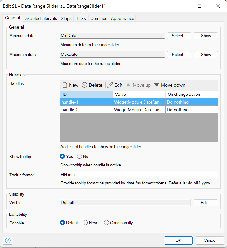
- Minimum date: minimum date for the range slider (date format)
- Maximum date: maximum date for the range slider (date format)
- The handles are the user input attributes that the user can control, you can add on change actions on these handles
- You can show a tooltip in a customized format when dragging the handle along the slider.
2.3.2 Disabled intervals
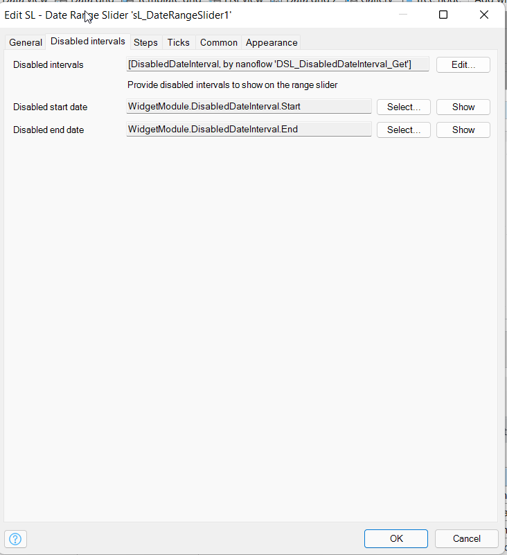
- Disabled intervals:Optionally you can specify disabled intervals, this has to be a List. These intervals will appear greyed out on the slider
- Disabled start date: Specify the startdate attribute for the interval
- Disabled end date: Specify the enddate attribute for the interval
2.3.3 Steps
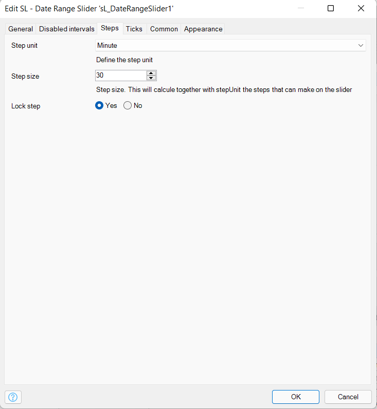
- Step unit: Specify the step unit in which the stepsize is measured
- Step size: Specify the step unit in which the handle can be moved along the slider
- Lock step: If toggled the slider can only be moved in increments of the step size/unit.
2.3.4 Ticks
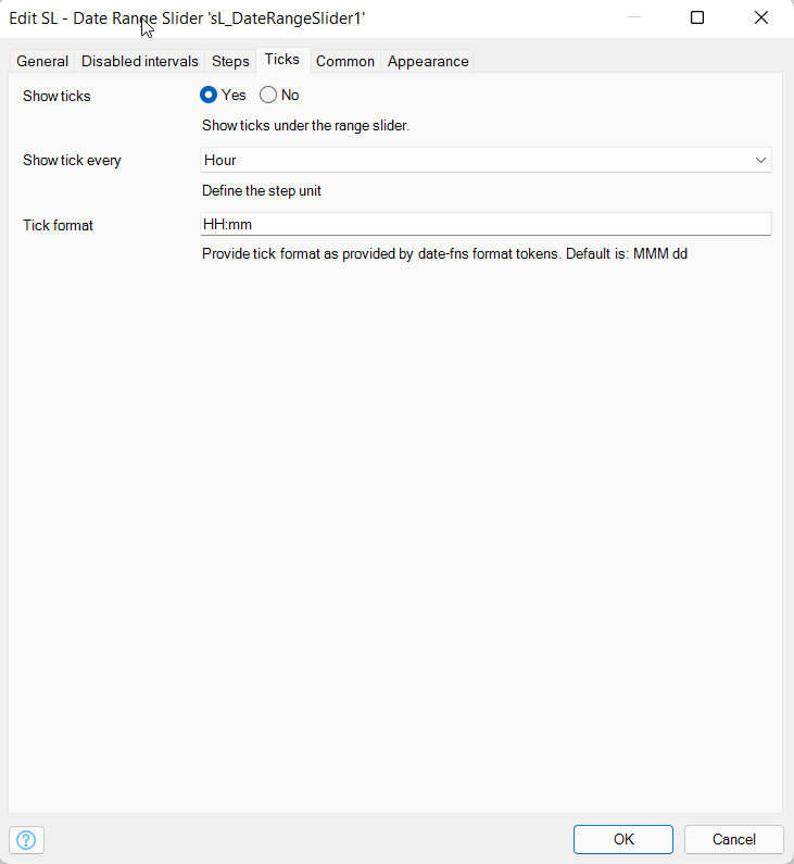
- Show ticks: Show the ticks under the slider
- Show tick every: Show the ticks under the slider in increments of the specified unit
- Tick format: The display format which is used to show the ticks under the slider.
3. Use Cases
- The widget can be used as a tool to easily select date ranges
- Can be used to visualise available time-slots inside a time-range.
4. Customization
Add a classname to the widget the adjust the widget to your likings.