-orange.svg)


Mendix Native Segmented Progress Bar
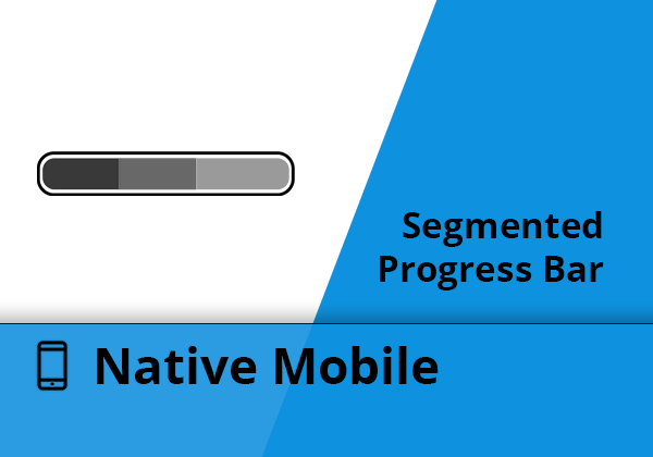
Show a segmented progressbar in your Mendix Native Mobile app.
Special thanks to Kshitij Karandikar (Github) for providing the initial idea & version!
Features
- Show a segmented progressbar with multiple segments
- Render your progress bar horizontal or vertical
- Can use a JSON String or Object List as Datasource
- Styling can be customized by using standard Mendix Native Styling
- On Click events for a segment
Usage
Data
Scenario 1 : JSON
- Use the JSON Source String to show a progress bar. This has to be a proper JSON array, where objects contain the following key-values:
[
    {
        "value": 10         // this is the numeric value, used to determine the size (the widget calculates the total value and sizes accordingly)
        "color": "#FF0000"  // HEX Color
        "sortOrder": 0      // Determine the sorting
    },
...
]
Scenario 2 : Objects
- Define the dataSource of objects (for example from the Database)
- Value & Color are both mandatory
- Sort is optional. If you do not define this, it will use the order set by the dataSource
Events
- When using Scenario 2 (Objects), you can define an onClick Action for a segment. The mendix object will be passed on as an input parameter.
UI
- You can set the rendering of the progress bar to either horizontal or vertical.
Styling
Styling is done in normal Mendix Native Styling procedures.
Class: com_mendixlabs_widget_native_segmentedprogressbar_SegmentedProgressBar
Default styling:
export const com_mendixlabs_widget_native_segmentedprogressbar_SegmentedProgressBar = {
    // ViewStyle properties for direction = "horizontal"
    container: {
        flexDirection: "row",   // We need this to render the bars horizontally
        width: "100%"           // We set the width to the maximum of the container
    },
    containerVertical: {
        flexDirection: "column",// We need this to render the bars vertically
        height: "100%"          // We set the height to the maximum of the container
    },
    item: {                     // ViewStyle properties that control all segments
        height: 20,             // Height of the progressbar (direction = "horizontal")
        width: 20,              // Width of the progressbar (direction = "vertical")
        borderRadius: 20        // Borderradius of first and last item
    },
    firstItem: {},              // ViewStyle properties for first segment (left when "horizontal", top when "vertical")
    lastItem: {},               // ViewStyle properties for last segment (right when "horizontal", bottom when "vertical")
    middleItem: {}              // ViewStyle properties for middle segments
};
Issues, suggestions and feature requests
This widget is NOT officially supported by Mendix
Report your issues on Github, see here
Development and contribution
- Install NPM package dependencies by using:
npm install. If you use NPM v7.x.x, which can be checked by executingnpm -v, execute:npm install --legacy-peer-deps. - Run
npm startto watch for code changes. On every change:- the widget will be bundled;
- the bundle will be included in a
distfolder in the root directory of the project; - the bundle will be included in the
deploymentandwidgetsfolder of the Mendix test project.
License
Apache 2