SL - Tooltip
Overview
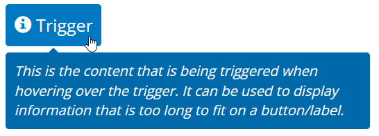
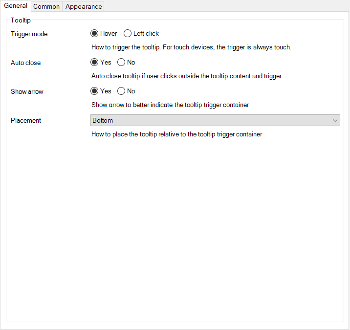
A tooltip is a brief, informative message that appears when a user interacts with an element. You can use this widget to display a tooltip when hovering over any element. Any element can be used as a trigger for the container. The content-container content is only loaded when hovering over the trigger. No need to create a class for every tooltip. The tooltip is customizable.
Documentation
SL Tooltip
Tooltip widget to show a customizable tooltip on hover.
1. Description
A tooltip is a brief, informative message that appears when a user interacts with an element. You can use this widget to display a tooltip when hovering over any element. Any element can be used as a trigger for the container. The content-container content is only loaded when hovering over the trigger. No need to create a class for every tooltip. The tooltip is customizable.
1.1 Browser example
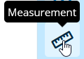
| Example 1 | Example 2 | Example 3 |
 |  |  |
2. Usage
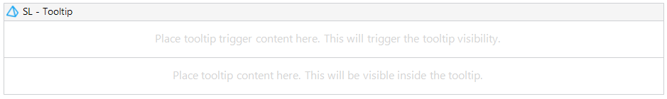
- Place any content in the tooltip trigger-container to trigger tooltip visibility.
- Place any content in the content-container to display when hovering over the trigger-container.
2.1 Modeler example
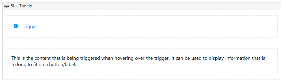
2.2 Configuration example
3. Use Cases
- When you need to provide the user brief informative message when hovering over an icon-button.
- This can be used with or without context.
4. Customization
You can stylize both trigger and content. If you want to style the content, the best way to do this is adding a container to the content pane and apply styling to the container.