Image Carousel Widget
Content Type: Widget
Categories: User Interface
Overview
Responsive and Customizable Image Carousel Widget for Mendix Apps
Documentation
Collapsible Header on Scroll (Mendix Widget)
-orange.svg?style=for-the-badge)
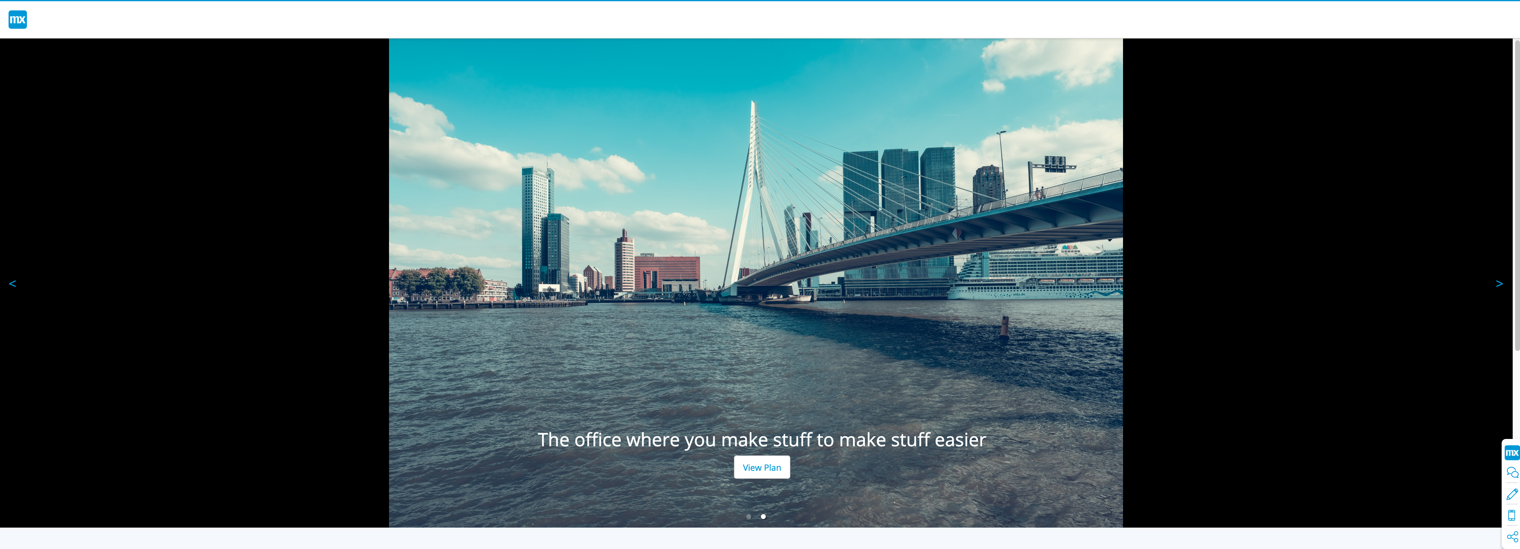
A Mendix Image Carousel Widget
Responsive and Customizable
Usage
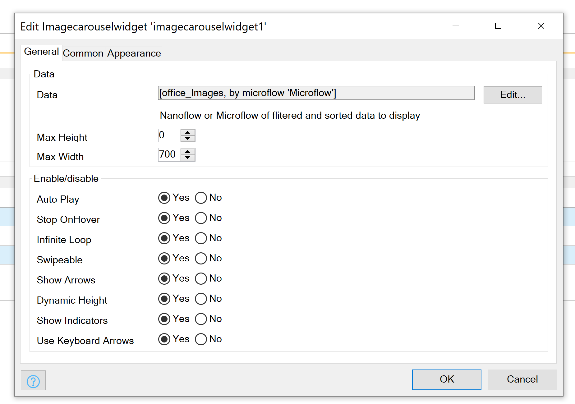
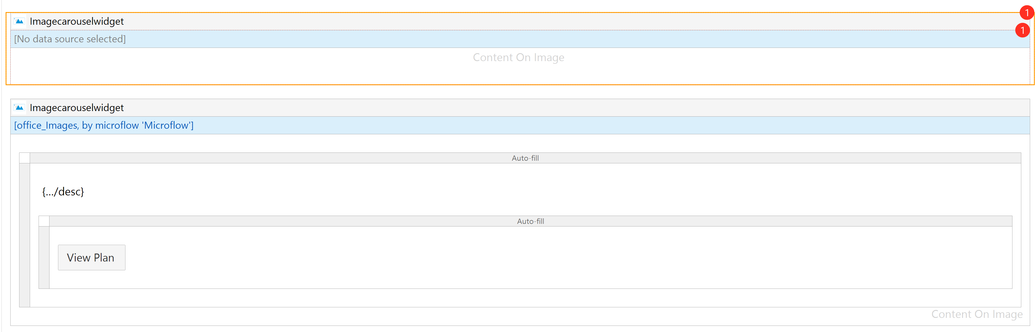
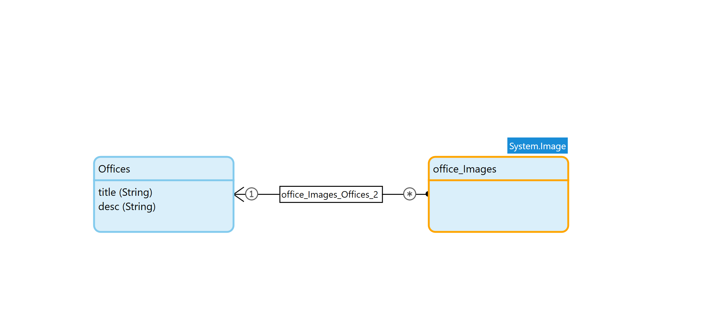
TypeInfoDatadatasourceDatasource of Datamodel to display. Linked to a System Image in One to Many RelationMax HeightnumberMax height of the Container, Optimize this value for the Images you plan on usingMax WidthnumberMax Width of the Container, Optimize this value for the Images you plan on usingAuto PlaybooleanShould Images Automatically ScrollStop on HoverbooleanShould Stop Scroll on Hover over ImageInfinite LoopbooleanShould Images Scroll foreverSwipeablebooleanAllow touch and track devices to scroll on SwipeShow ArrowsbooleanDisplay Next/Prev ArrowsDynamic HeightbooleanShould Height be based on Image Height (use with caution with Max Height)Show IndicatorsbooleanShow Indicators Dots on ImagesKeyboard ArrowsbooleanShould Scroll be affected by Keyboard Arrows
Exposed Class Names
Desc.Image-Carousel__PrevClass Name on Prev ButtonImage-Carousel__NextClass Name on Next ButtonImage-Carousel__ContentClass Name on Anything you place in the Content boxImage-Carousel__Content__INDEXNUMERClass Name on Everything in Content Box based in its IndexNote - Carousel__Content__INDEXNUMER if there are 2 Images the first Image's class name will be Carousel__Content__0 the second Carousel__Content__1
Examples

Releases
Version: 1.0.0
Framework Version: 8.12.5
Release Notes: Responsive and Customizable Image Carousel Widget for Mendix Apps