Collapsible Header on Scroll (Mendix Widget)
-orange.svg?style=for-the-badge)

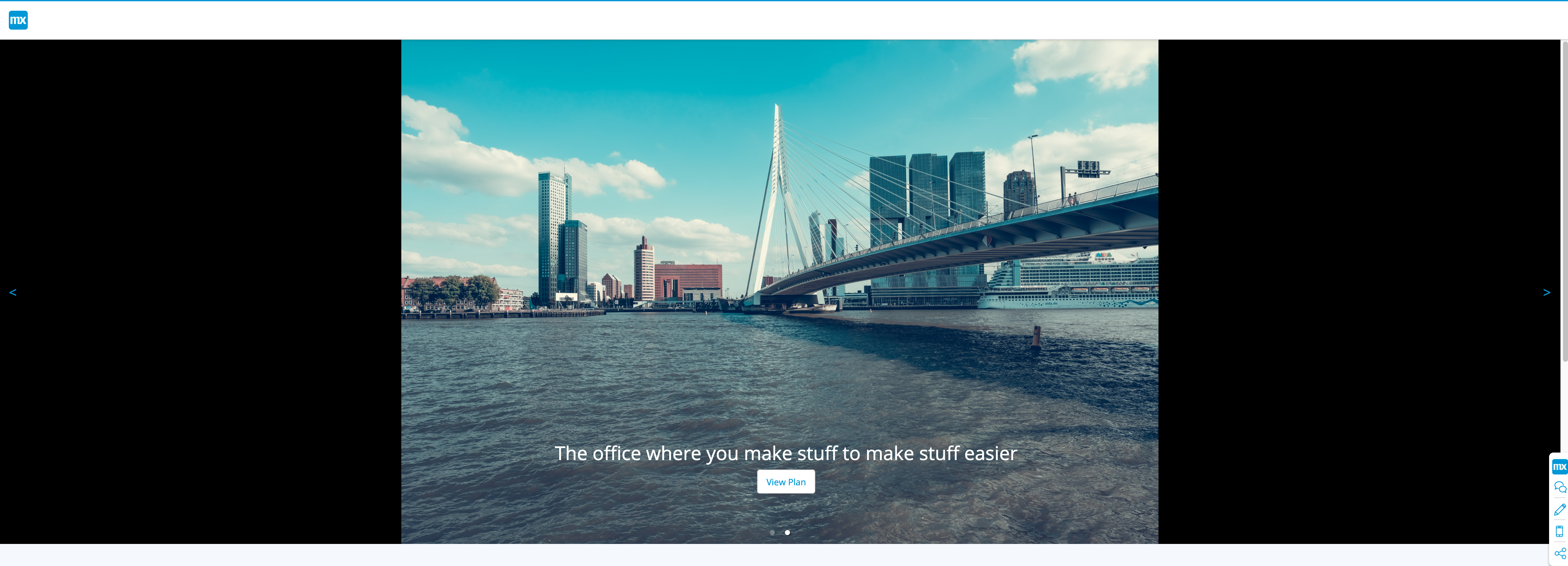
A Mendix Image Carousel Widget
Responsive and Customizable
Usage
| Type | Info | |
|---|---|---|
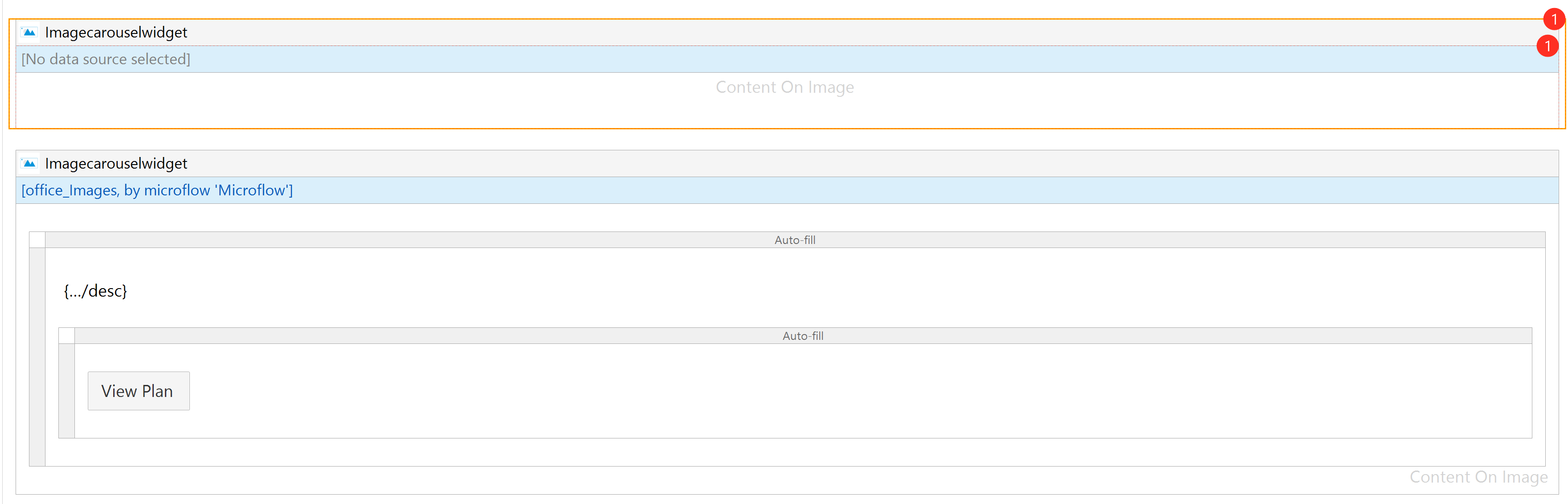
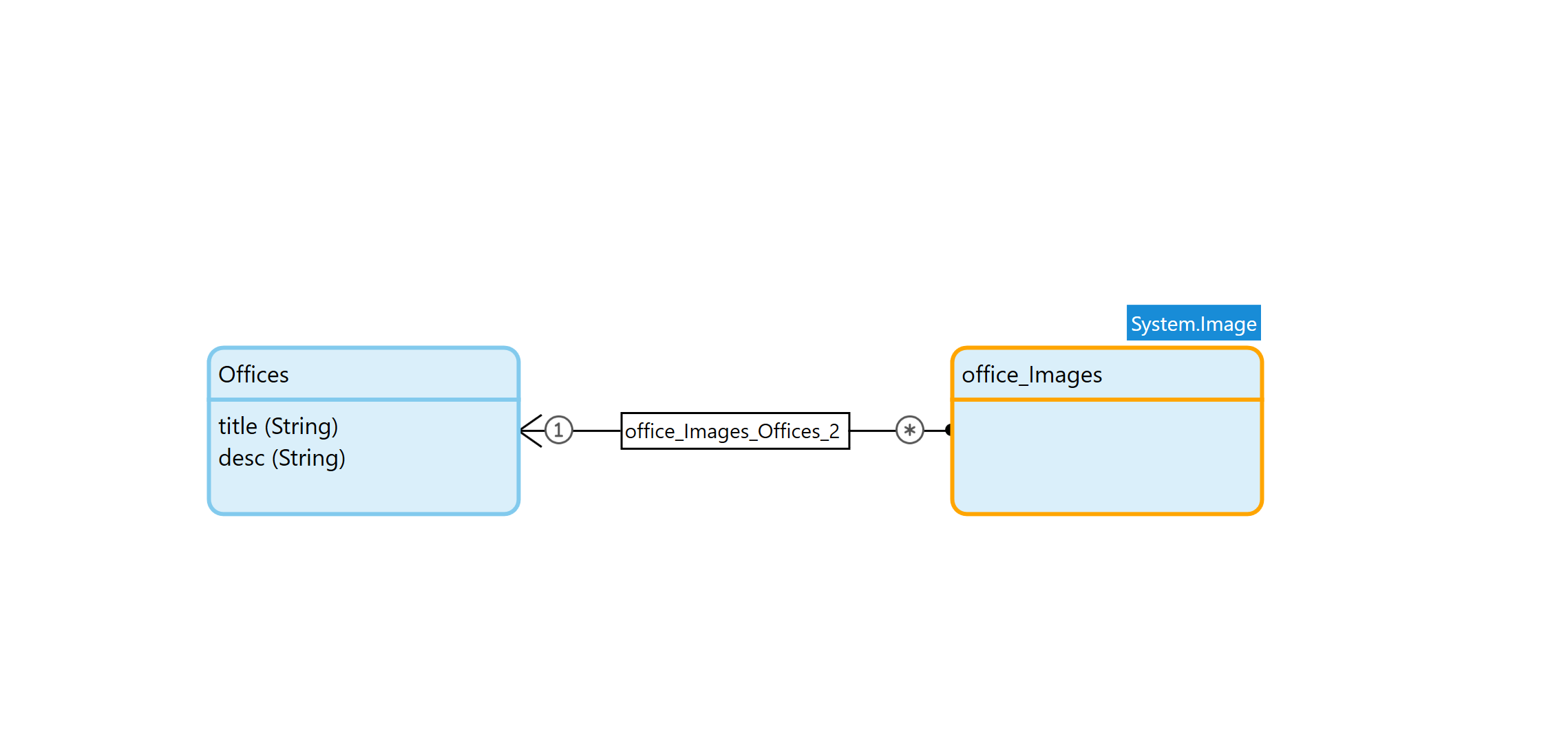
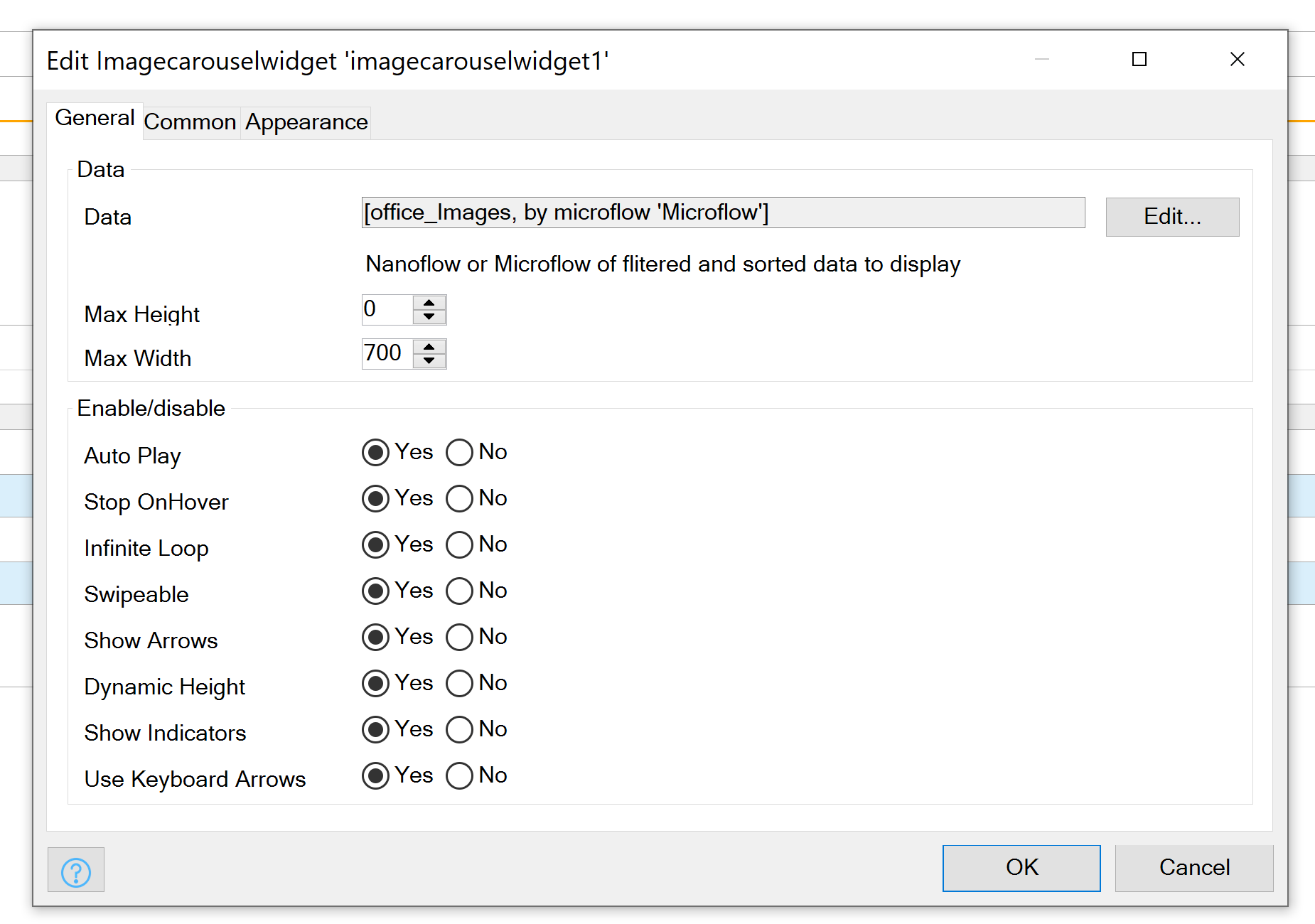
| Data | datasource |
Datasource of Datamodel to display. Linked to a System Image in One to Many Relation |
| Max Height | number |
Max height of the Container, Optimize this value for the Images you plan on using |
| Max Width | number |
Max Width of the Container, Optimize this value for the Images you plan on using |
| Auto Play | boolean |
Should Images Automatically Scroll |
| Stop on Hover | boolean |
Should Stop Scroll on Hover over Image |
| Infinite Loop | boolean |
Should Images Scroll forever |
| Swipeable | boolean |
Allow touch and track devices to scroll on Swipe |
| Show Arrows | boolean |
Display Next/Prev Arrows |
| Dynamic Height | boolean |
Should Height be based on Image Height (use with caution with Max Height) |
| Show Indicators | boolean |
Show Indicators Dots on Images |
| Keyboard Arrows | boolean |
Should Scroll be affected by Keyboard Arrows |
Exposed Class Names
| Desc. | |
|---|---|
Image-Carousel__Prev |
Class Name on Prev Button |
Image-Carousel__Next |
Class Name on Next Button |
Image-Carousel__Content |
Class Name on Anything you place in the Content box |
Image-Carousel__Content__INDEXNUMER |
Class Name on Everything in Content Box based in its Index |
Note - Carousel__Content__INDEXNUMER if there are 2 Images the first Image's class name will be
Carousel__Content__0 the second Carousel__Content__1
Examples