Native Calendar
Content Type: Widget
Categories: Mobile
Overview
A React Native Calendar for Mendix Native (with Dark Mode Support)
Key Features:
- Display Data on Calendar
- Disable User Press Action base on Boolean in Domain Model
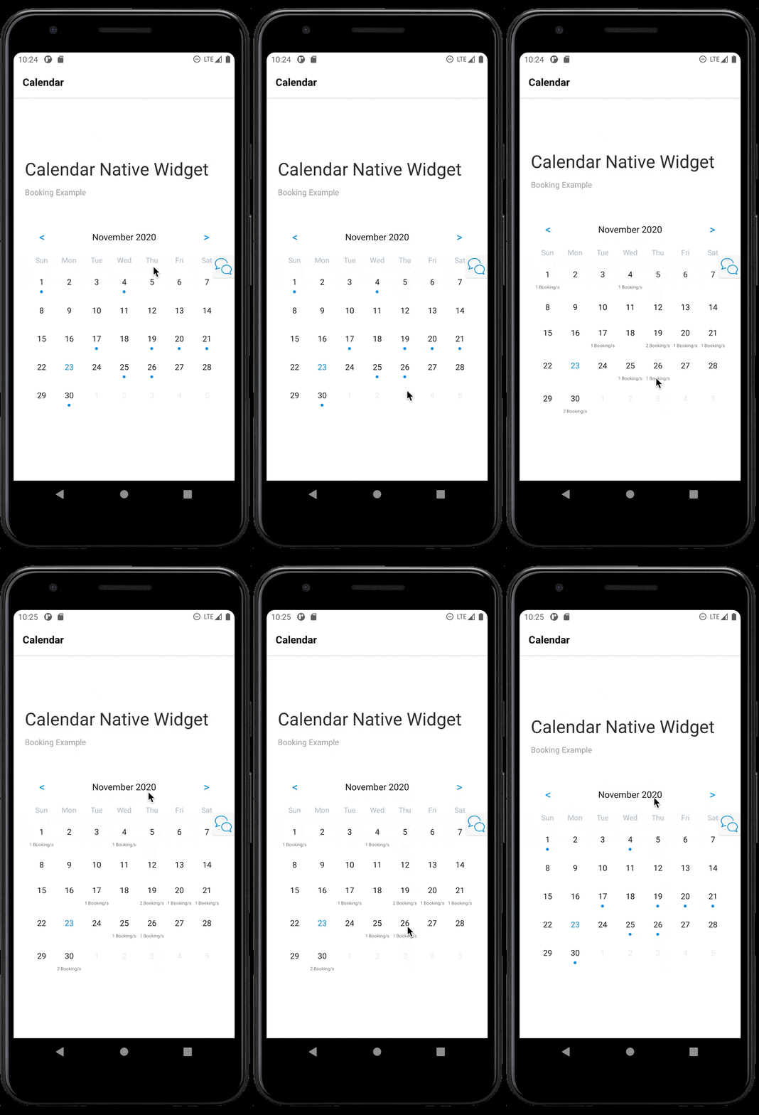
- Swipe down for a summary
- Disable month Change
- Disable Weekends
- Disable Passed Dates
Docs found here: https://mendixlabs.github.io/app-services-components/
Documentation
Demo url
Calendar Widget for Mendix Native

A React Native Calendar for Mendix Native (with Dark Mode Support)
You can track current status and add feature requests on the Github Project Board
Examples
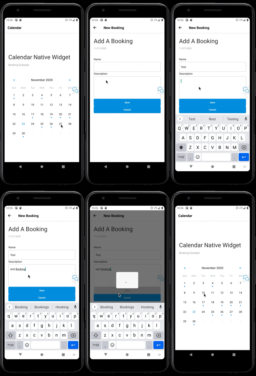
Add a Date
Swipe Down for More
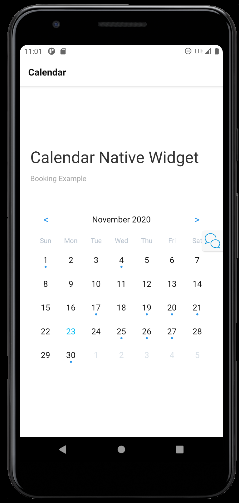
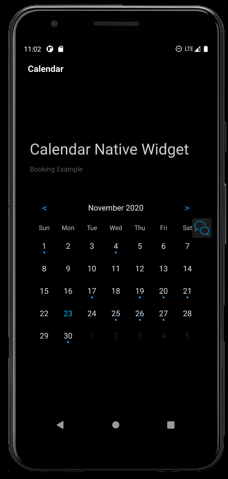
Display Modes
Light
Dark
Usage
In its current form the Calendar put most of the Power in the Mendix Developers hands. The Widget tries to be a Minimal as possible while staying powerful.The Idea at a higher level :
- You provide the widget with a list data source and specify the Date Entity.
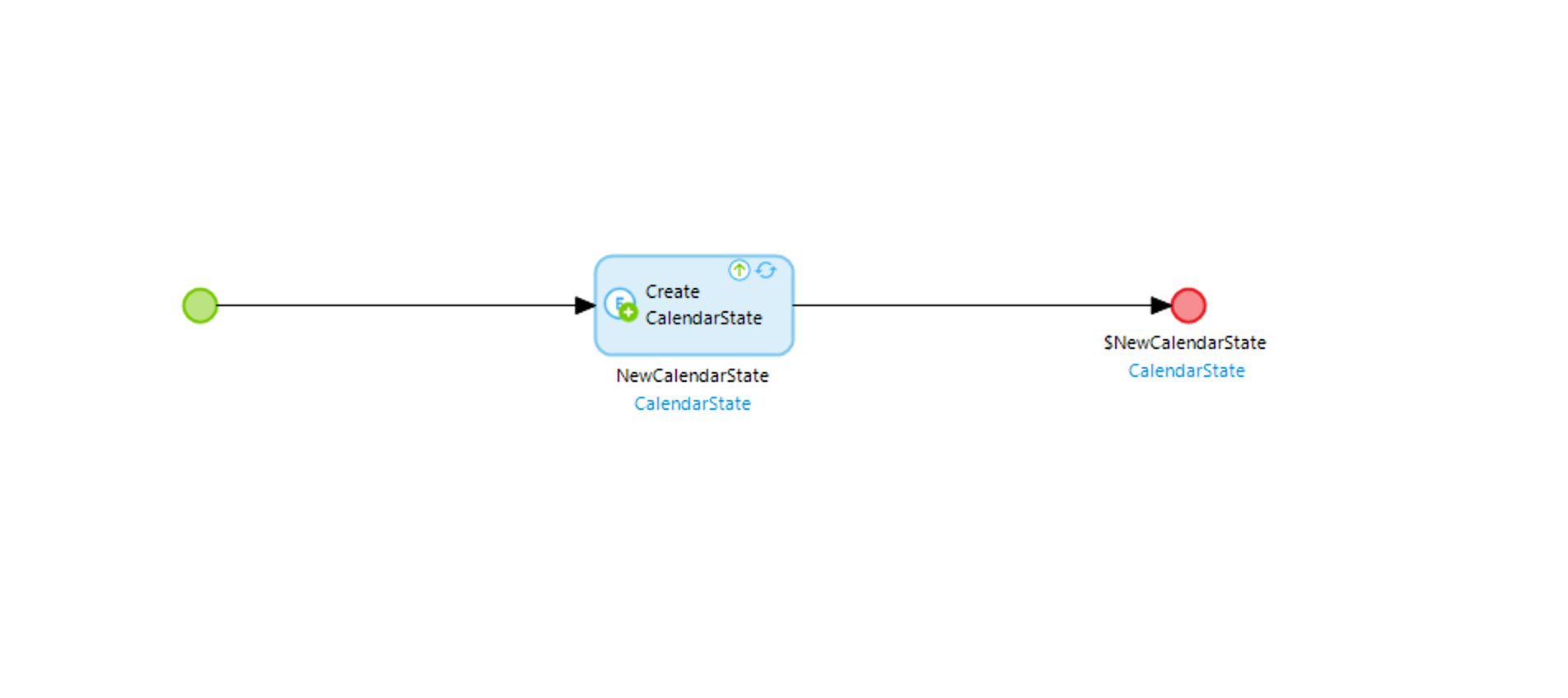
- You wrap the Widget in a data source that is ideally Volatile/Non Persistable. This value will be consumed by the Widget and changed/manipulated. (Think of this like Redux/Mobx state)
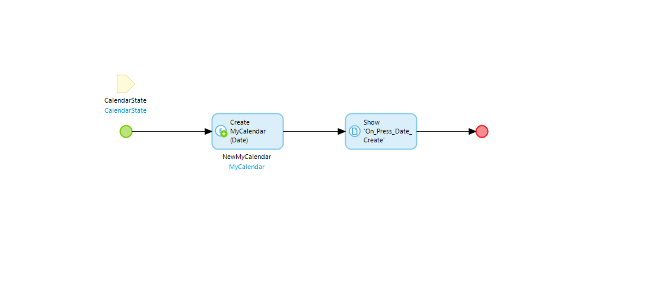
- Pass the OnClick Option a Nano flow with the Parameter. This parameter will be the altered value (The date the user Pressed on) You as Mendix Dev can then deicide what to do with it.
Data
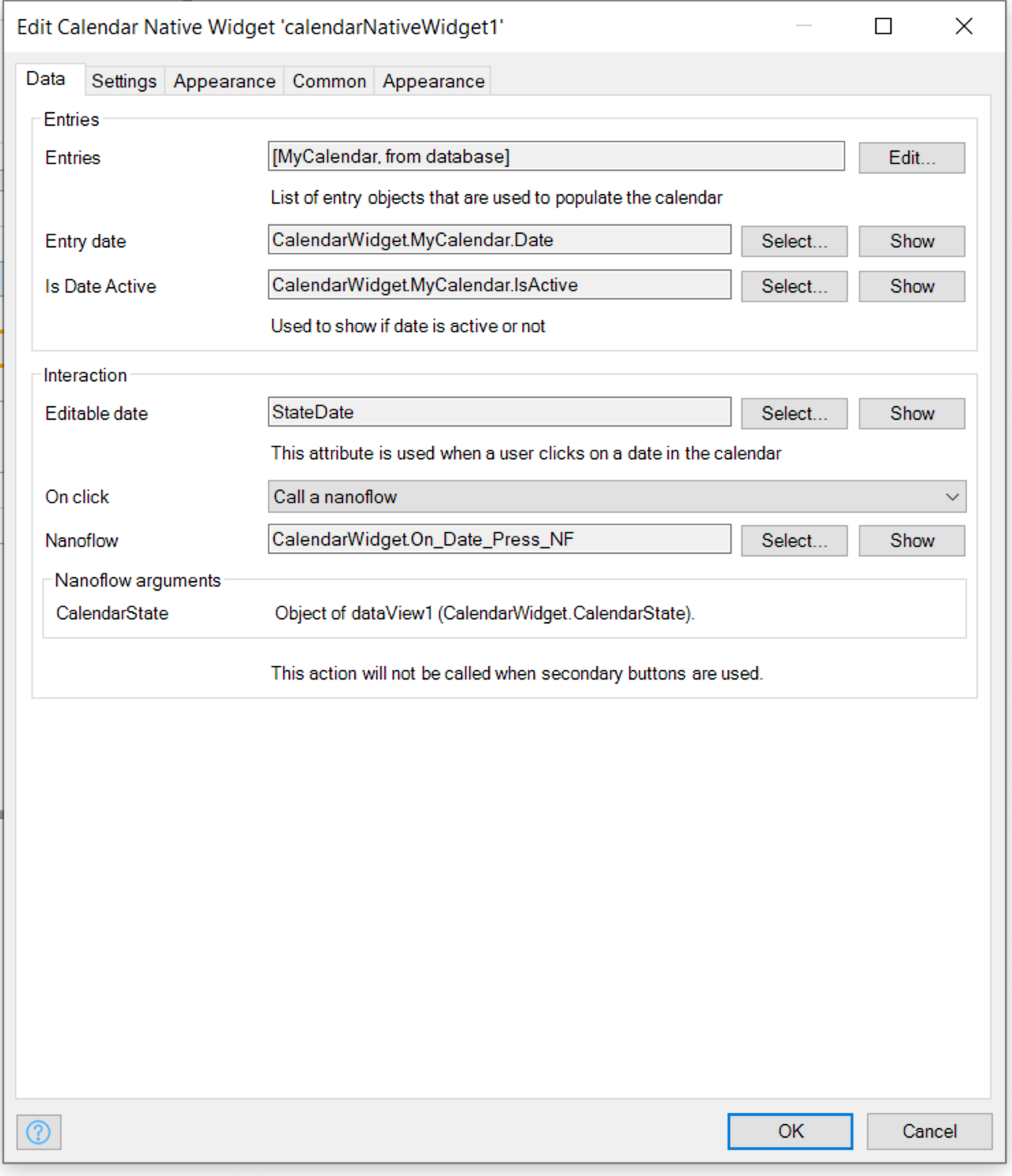
TypeInfoIncoming DatesData SourceList of Dates to DisplayDateDateTimeAttribute in Date Source that is of Type DateIs Active DateBooleanIf false the date will be greyed (Coming from data Model)Volatile DateDateTimeNon Persistable Date that the Widget can Change and Mendix Developer can ObserveOnClickActionAction to Happen when the User Clicks on the Date - Usually a Nano Flow used to Open Page to either Add New Date or Display all entries for selected date.Settings
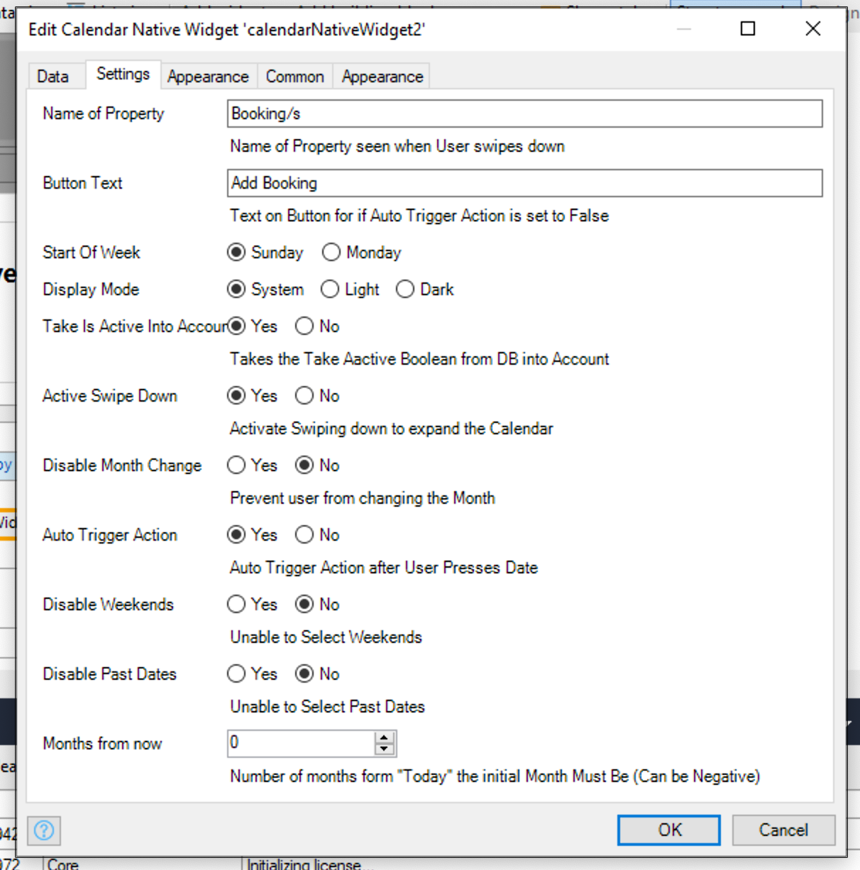
TypeInfoName of PropertyStringName of Property seen when User swipes down If Activate Swipe Down is True/YesButton TextStringText on Button If Auto Trigger Action is set to False/NoTake Is Active Into AccountBooleanIf false Is Active Date will be ignoredStart Of WeekENUMOn what day is the start of the weekDisplay ModeENUMChanges the Calendar "theme", based on what display mode the users device is on Either System (will take what the current device is on), or Light or Dark.Active Swipe DownBooleanActivate Swiping down to expand the Calendar - Users will see an count of Calendar entriesDisable Month ChangeBooleanPrevent user from changing the MonthAuto Trigger ActionBooleanAdds a button to the bottom of Calender, Allows user to select dat without triggering onClick actionDisable WeekendsBooleanPrevents user from selecting WeekendsDisable Past DatesBooleanPrevents user from selecting dates in the PastMonths from nowIntegerPositive or Negative Integer. sets the default starting month from Today.Appearance
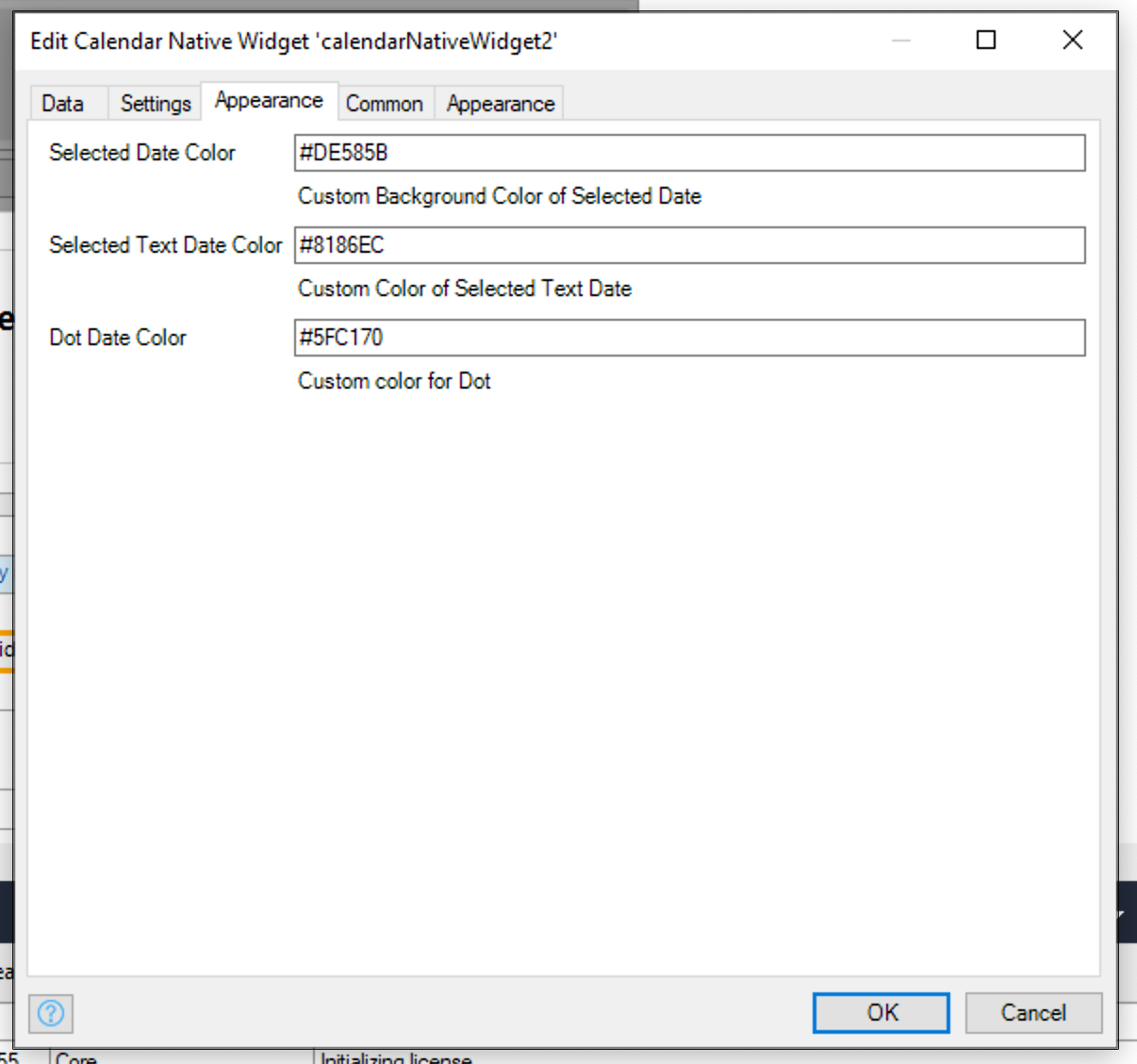
TypeInfoSelected Date ColorStringCustom Background Color of Selected DateSelected Text Date ColorStringCustom Color of Selected Text DateDot Date ColorStringCustom color for DotScreenshots
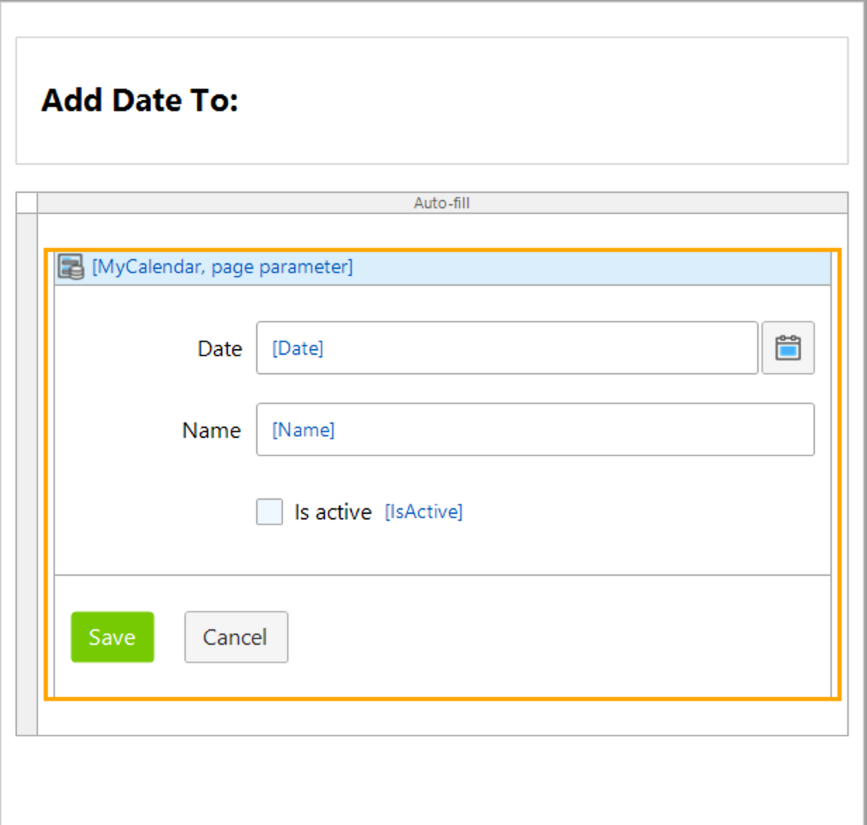
Add Date Page
On Press Date
Create State
Releases
Version: 1.0.6
Framework Version: 8.12.5
Release Notes: Added Date Select Color attribute and Date Dot Color attribute
Version: 1.0.5
Framework Version: 8.12.5
Release Notes: Added Attributes to make Date Color And Dot Color attributes
Version: 1.0.4
Framework Version: 8.12.5
Release Notes: added dynamic Offset - User can now Set Month offset Dynamically
Version: 1.0.3
Framework Version: 8.12.5
Release Notes: Fix issue #3 for date formatting.
Version: 1.0.1
Framework Version: 8.12.5
Release Notes: A React Native Calendar for Mendix Native (with Dark Mode Support)
Note: Currently Offered as Beta - Please open Feature requests/issues on GitHub (See Documentation Tab)
Key Features:
Display Data on Calendar
Disable User Press Action base on Boolean in Domain Model
Swipe down for a summary
Disable month Change
Disable Weekends
Disable Passed Dates
Version: 1.0.0
Framework Version: 8.12.0
Release Notes: A React Native Calendar for Mendix Native (with Dark Mode Support)
Note: Currently Offered as Beta - Please open Feature requests/issues on GitHub (See Documentation Tab)
Key Features:
- Display Data on Calendar
- Disable User Press Action base on Boolean in Domain Model
- Swipe down for a summary
- Disable month Change
- Disable Weekends
- Disable Passed Dates
